Menace Collective
Menace Collective is a multimedia content platform with the purpose of amplifying the voices of marginalized communities who are oppressed and often unheard. They strive to utilize creativity as a pathway towards positive community-building and collective liberation.
My Role
This was a remote collaborative project where I had the opportunity to serve in many roles. I facilitated interviews for both the initial stakeholder meeting and the interview sessions with users and then synthesized the data. I ideated features, created some low/mid-fidelity web screens, and all of the mobile low fidelity wireframes. I partnered with a team member to design the high fidelity mobile screens and then I created the annotated wireframe packet to hand over to our client.
Goal
Our goal was to propose a design strategy and an interface that readers will engage with, helping to create a meaningful experience and prompting users to take community action through a collection of connected resources.
Clients
Ramla Bile and Dominique Diaddigo-Cash are writers and grassroots organizers creating Menace Collective
Users
Content consumers- greater Minneapolis/St. Paul metro area residents
Content curators- organizes meaningful & impactful media from marginalized community members
Content creators- Artists, writers, and creatives
Research Methods
Stakeholder Interview
Comparative Analysis
Moderated Remote Interviews
Card Sorting
Survey
Tree Testing
Tools
Sketch
InVision
Miro
Figma
Zoom
Slack
Google Slides
Google Docs
Pencil and Paper
Problem
Content consumers need an engaging and accessible digital platform in order to consume local creative content that uniquely elevates the voices and stories of marginalized community members and drives them to create change through community action.
Stakeholder Interview
Goals: To gain a better understanding of the stakeholder needs, pain points, and opportunities for this multimedia content platform.
Insights: I learned that the client was very passionate with a strong concept, and was not very far along in the process of building the platform. This gave us the exciting opportunity to build this platform completely from the ground up.
Key Takeaways
Engagement is key and should be a big focus
Answer design questions about how to best consume content
Research if Squarespace is best platform for their design needs
Synthesized data and raw data from interview
Comparative Analysis
Goals: Comparator platforms were examined to determine what conventions are in place for a multimedia content platform and how Menace Collective could leverage them.
Insights: Because Menace Collective is meant to be a multimedia platform with content such as audio, video, podcasts, visual art, and other creative media, looking at all of these news media outlets that have mostly articles sometimes led us in the wrong direction with our purpose. We had to constantly remind ourselves that we were not building a conventional news website.
Moderated Remote Interview Sessions
Goals: Comparator platforms were examined to determine what conventions are in place for a multimedia content platform and how Menace Collective could leverage them.
Insights:
Most users find their content from social media shares
Users want to engage in discussion online, but do not feel safe in most online forums
Users want a scannable format for content such as bulleted lists, summaries at the beginning, images, infographics, and narrations for articles.
Click to view data from interviews
Feature Ideation/Dot Voting
Goal: As a team we used our synthesized data to ideate features. Since we were all working remotely, we utilized a Miro board for collaboration and we each made post-its for our ideas. We used dot voting as a method of choosing which features to design.
Insights: Miro is a really great tool for everyone to share and organize their ideas when working remotely. I think dot voting would have been a good idea as a first round of narrowing down the features, but then we should have also discussed and defended our choices more in depth. Later in the project we ended up revisiting features we placed in the icebox, and it would have saved us time if we had landed on those features initially.
Each team member was given 10 dots (aka owl emojis) to place on features. The features with the most dots were added to the key features list and the rest were placed in an icebox.
Branding/Identity Ideation and Survey
Goal: Each member of our team used the stakeholder’s branding vision of a punk/DIY aesthetic to create style tiles to be tested with users. To determine which feelings each design concept elicited, participants were asked in a survey to choose words from a list of adjectives. These results were used to create a style guide for the platform.
Insights: Users responded positively to the style tiles with the black and yellow color schemes. We made the rest of our design decisions based on the results that had the attributes of provocative, exciting, and inclusive to users, while ruling out styles that were uninviting or gave users a sense of fear.
This is the style tile I created to reference the punk/DIY aesthetic of cut outs, ben day dot printmaking, and a bold yellow accent color which implies “caution” to conceptually play into the theme of the “menace.”
Architecture Diagram
Goal: After choosing our key features, we set to create an architecture diagram for the entire platform so we could decide which user flows were the top priority for high fidelity prototyping.
Insights: We realized that we needed to establish the platform’s navigation and taxonomy. We went through the research and decided that we could not decide without further testing so a remote card sort and tree test were sent out and the navigation and taxonomy were created from those results.
Mobile Wireframes
As a team, we decided that we should design Menace Collective in a responsive web format because our research showed that our users view content on different devices. I took the lead on designing all of the mobile wireframes. I started with low fidelity sketches so I could quickly iterate my designs.
Mobile Annotated Wireframes
Goal: Next, a team member and I shared the work of creating the high fidelity mobile screens in Figma for the interactive prototype.
Insights: Because we were doing all of this work remotely, Figma was a great tool for us to collaborate and design together. I took the lead on using the static screens to create a document of annotated wireframes to hand over to the clients.
My team used our Miro board to keep track of our work.
Our collaborative Figma file where the interactive prototype was created.
My Key Screens
These are the high-fidelity key screens that I designed from start to finish. Another team member created the rest of the high-fidelity screens based on the low-fidelity designs I created. These screens were used for the interactive prototype.
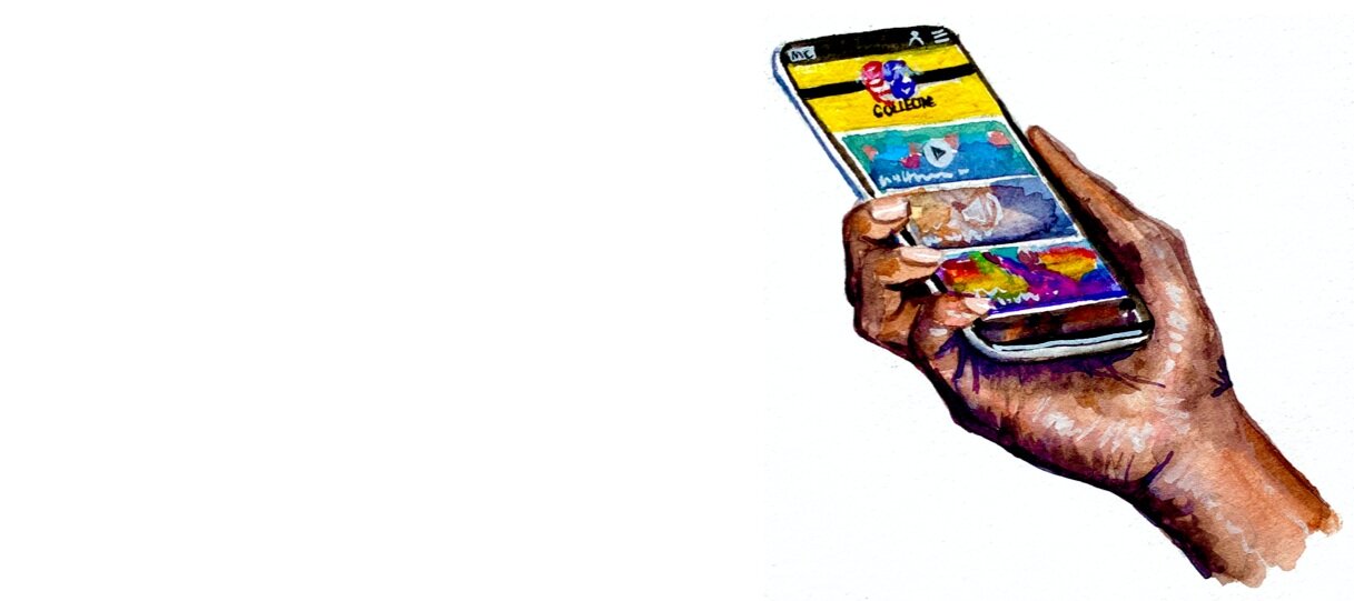
Home Page
Content: Article
Content: Gallery
Content: Podcast
Client Presentation
As a team, we remotely presented our research, findings, design process, and final product in the form of interactive prototypes to our clients. From 5:30-8:00 I present the key features and reasoning based in research. Figuring out how to present a deck and two prototypes with four people over Zoom took some strategy and practice, so I was very fortunate to be on a team with incredibly talented and capable UX designers.
Conclusion
The two biggest challenges for this project were 1. navigating the ambiguous framing for this concept to create a multi-media content platform our clients would be thrilled with and 2. collaborating with a completely remote team. These challenges were overcome by communicating using online collaboration tools.
Miro proved to be a valuable tool for our team because we were each able to contribute our assets and research findings in one space that we could reference at any time. This was helpful during the beginning of the project when we were deciding which features were the most important and during the design phase so we could share each iteration of the design process.
Figma was a great tool to use for the prototyping phase so my partner and I could access each other’s wireframes to maintain consistency within the design process.
During work hours my team would be on Zoom together so we could have conversations about the project, and we used Slack to communicate in the off-hours. This was a great way to collaborate because we were able to accommodate each team member’s preferred working habits.